- Designer: Brian Tucker
- Project: Sigler 2021-2022 Calendar
- Design Style: Vector illustration converted from pencil sketch
- Ink: PMS 7472, 7506, 021, and Neutral Black
- Paper: 100C Bright White Finch Fine Smooth
- Special Treatments: Clear Foil on Scales
Let’s Get Literal (LGL) is a fun, interactive series of designs based on “literal” interpretations. LGL combines several things we love – clever concepts, design collaboration and creating campaigns that delight and engage people – and it’s up to the end-user to guess and check their answers at LetsGetLiteral.com.
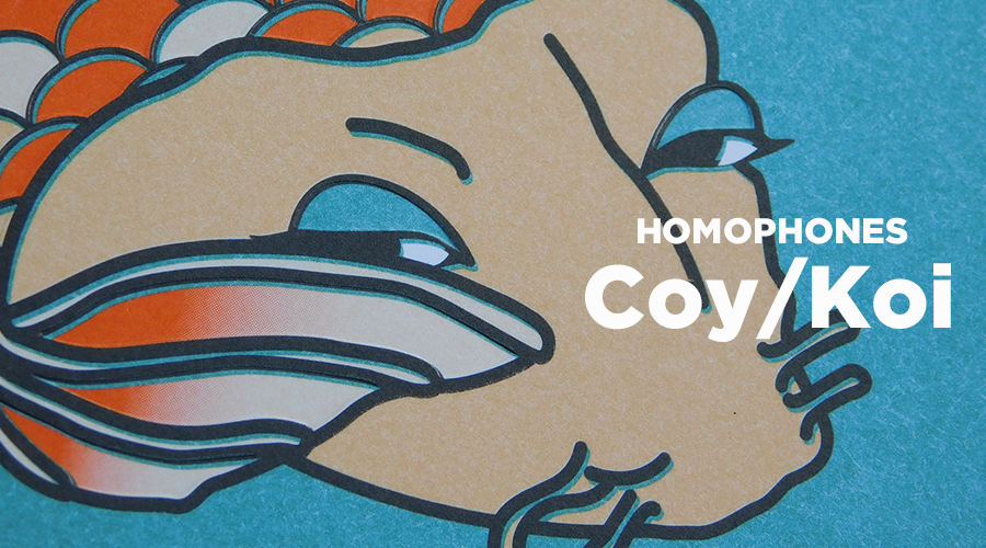
Sigler's LGL 2021-22 calendar theme is HOMOPHONES (words that sound the same but have different meanings.) It utilizes the same 4 spot-color inks throughout to unify the unique aesthetic of our talented designers.
November 2021
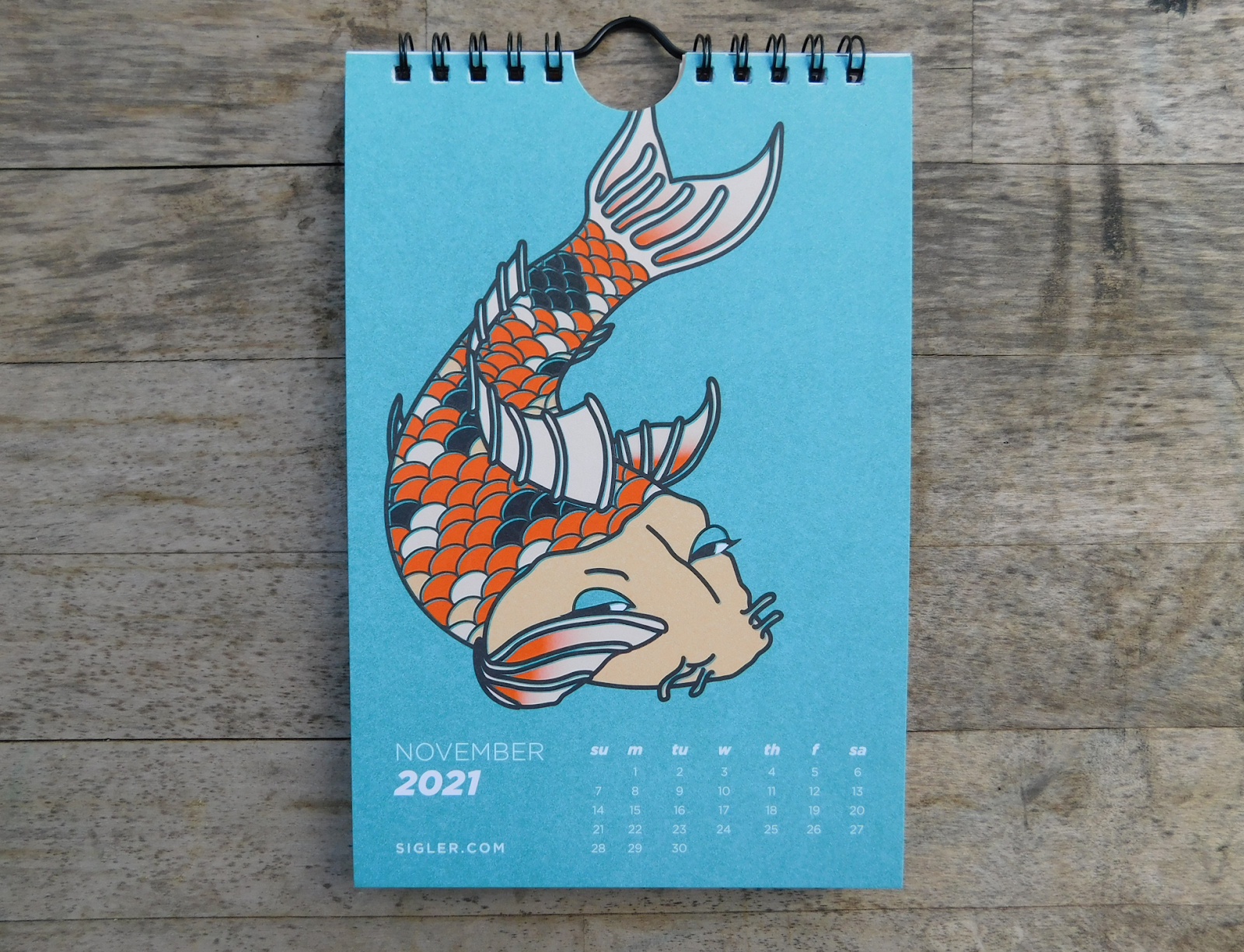
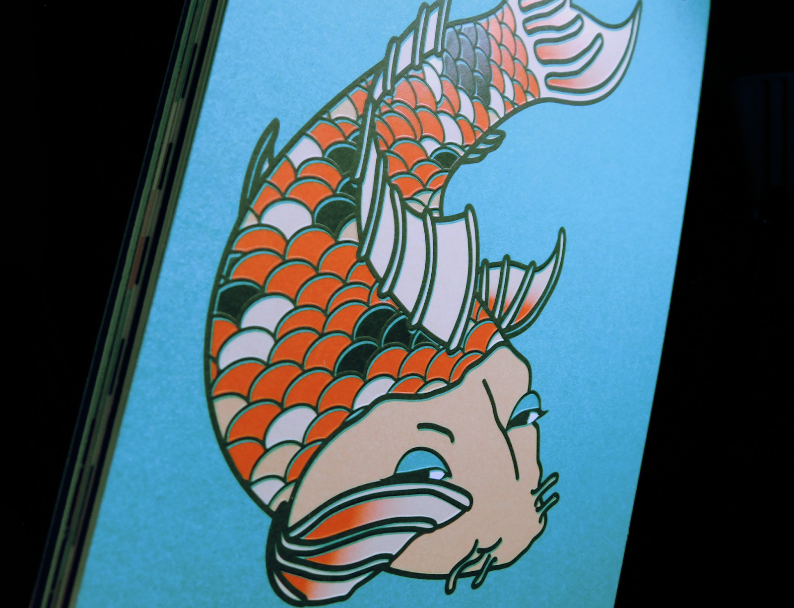
In Brian's words: After we compiled a list of options to choose from for this year’s HOMOPHONES theme, I picked Coy/Koi because I think it’s the best homophone ever. On top of that, it was the perfect muse for the type of design I wanted to do.
I’m a big fan of traditional Japanese watercolor paintings and art prints so I wanted to base my design off that style. I started with a pencil sketch illustration that I scanned and converted into a vector illustration. I chose a clear foil to add to the scales that would catch a subtle glint of light and create a texture that mirrored real fish scales.
It’s a great example of how the slightest special treatment in print can really make a design more interesting – even if the design is already based off what’s, in my opinion, the most interesting homophone there is!
You can see how offsetting the colors just slightly away from the outlines gives the design more flair.
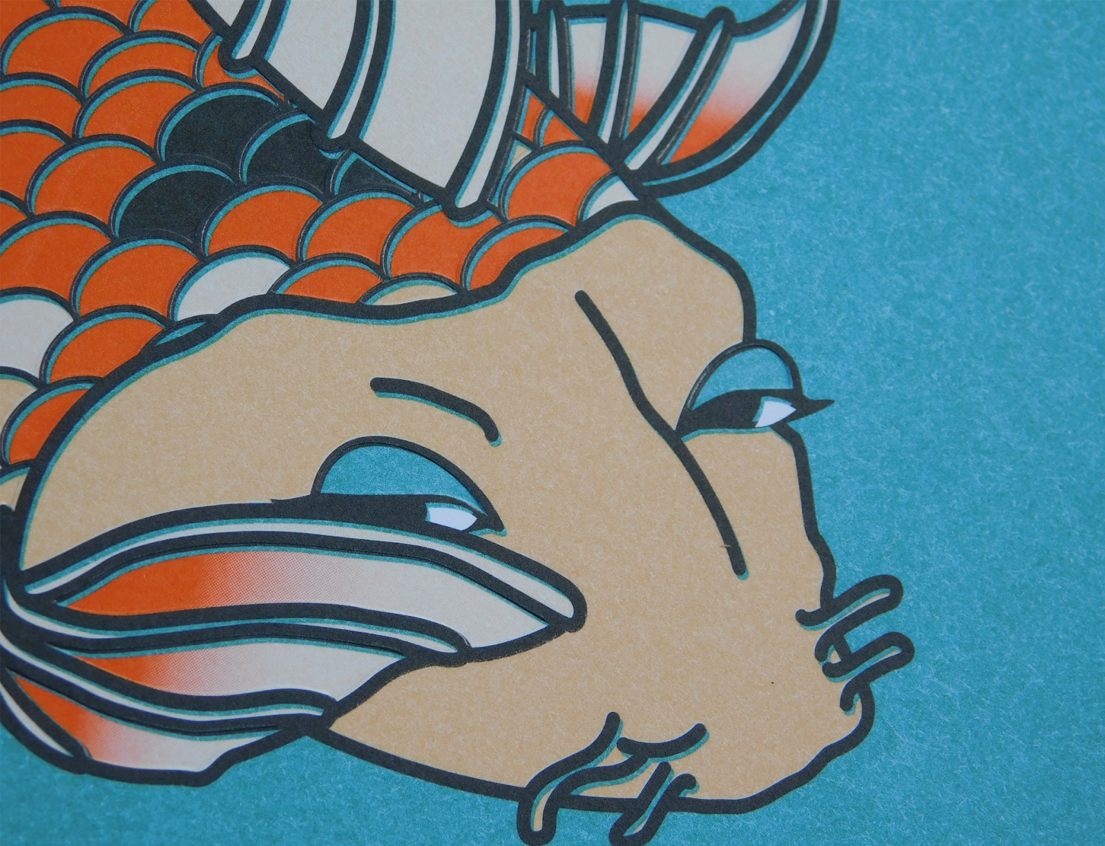 The effect of the clear foil at work.


You can see how the application of the foil pressed the scales downward making the outlines pop outward.


Calendar back
To learn more about the production of the entire calendar, you can read our blog here.
If you’d like to make your next print project have maximum impact – Sigler's ready to help. CALL US AT (800) 750-6997 or jump right in and fill out our project planner.
To download Coy/Koi for your screens, click here.
Didn't receive a Sigler calendar this year? Never fear. Download a free printable version here.