Let’s Get Literal (LGL) is a fun, interactive series of designs based on “literal” interpretations. LGL combines several things we love – movies, design and creating campaigns that delight and engage people. This year’s calendar theme is MOVIE TITLES and it’s up to the end-user to guess and then check their answers at LetsGetLiteral.com.
September's design was inspired by taking risks, keeping it classy with a punch, trusting your gut and thinking beyond your own page to create a breathtaking result.
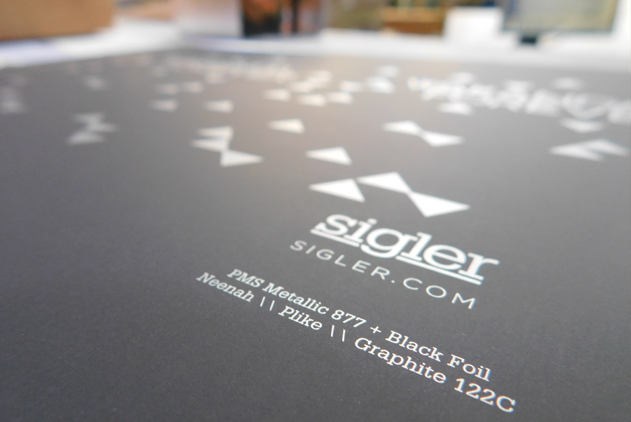
- Designer: Jenny Butcher
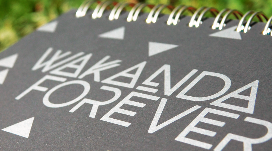
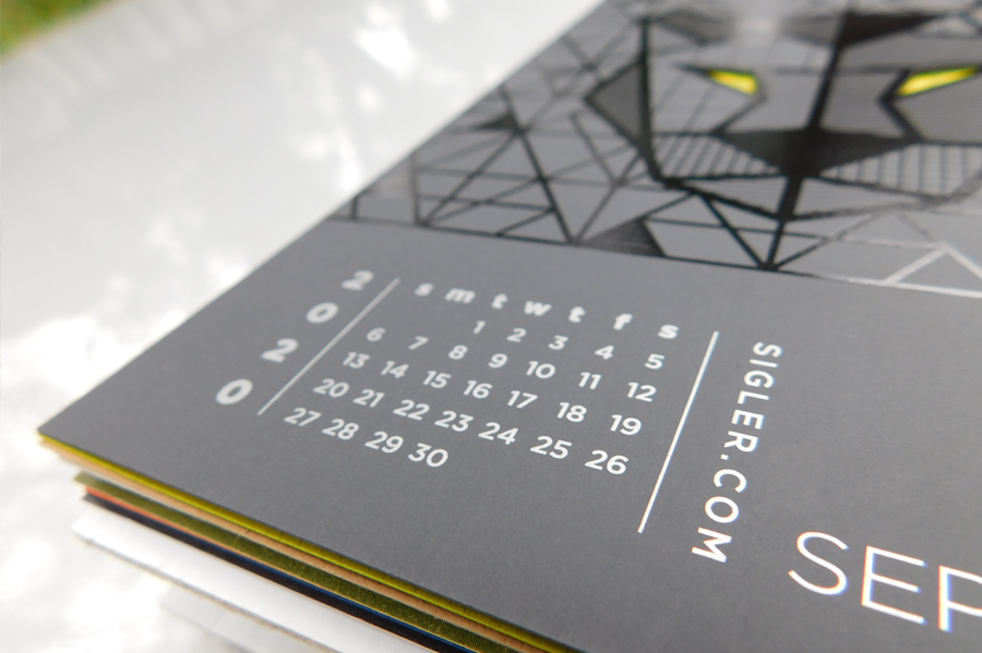
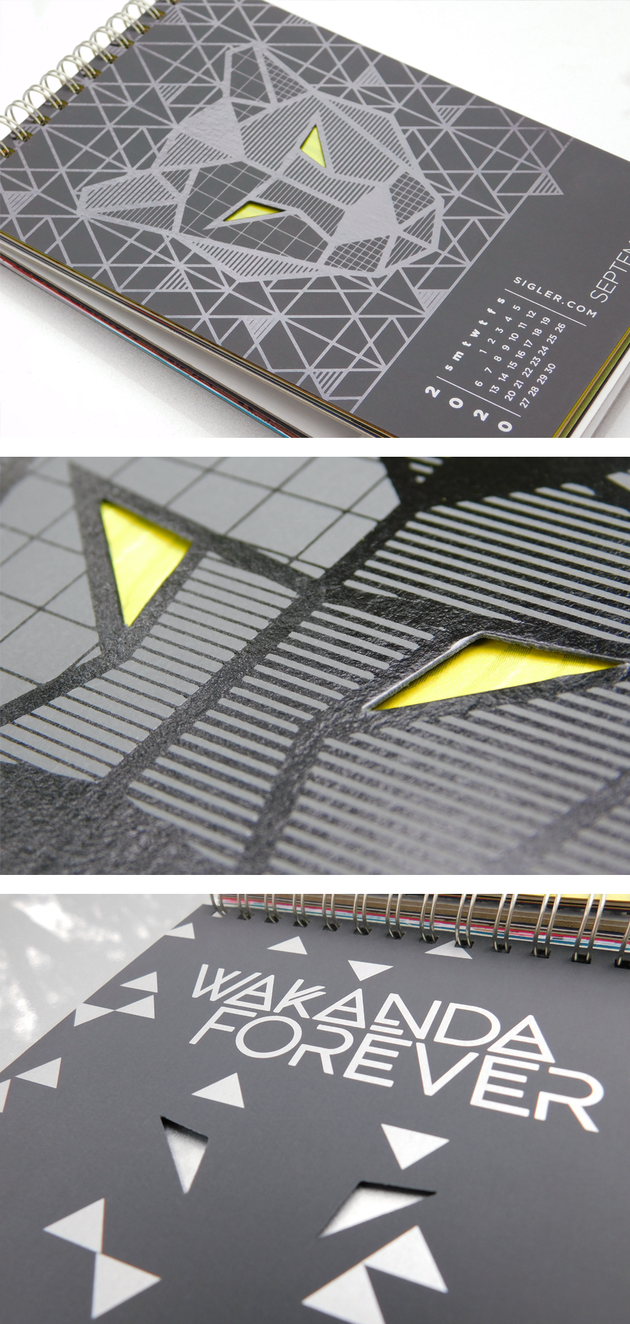
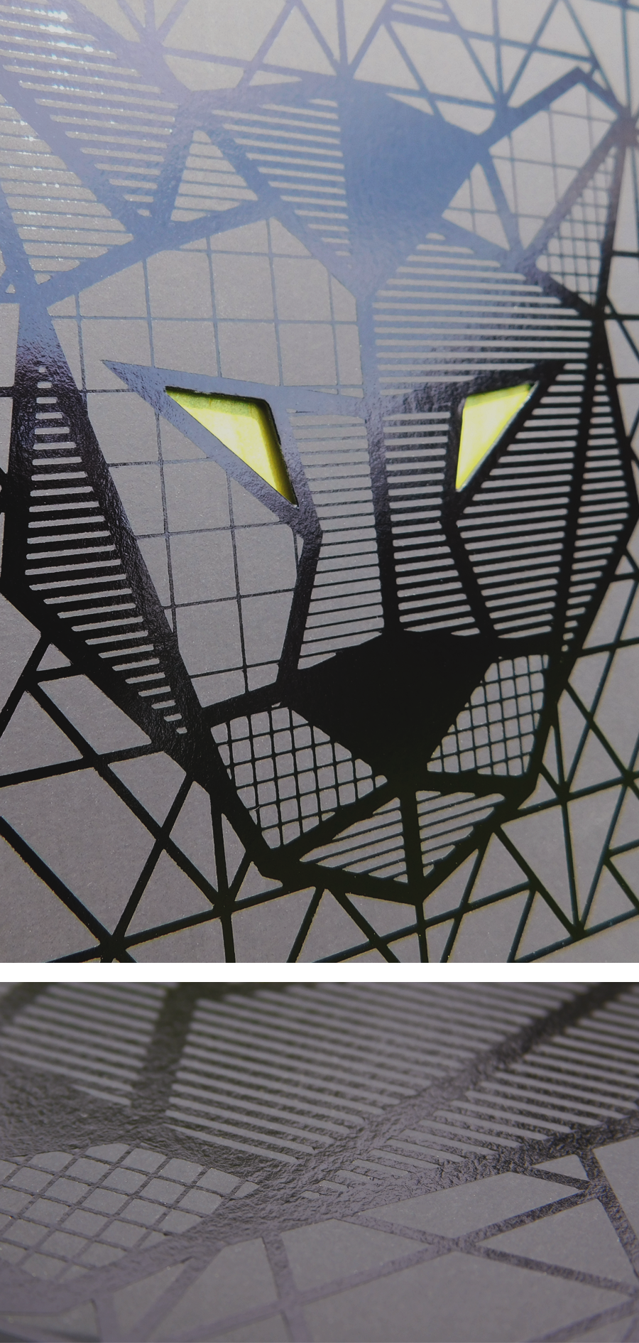
- Movie Title: Black Panther
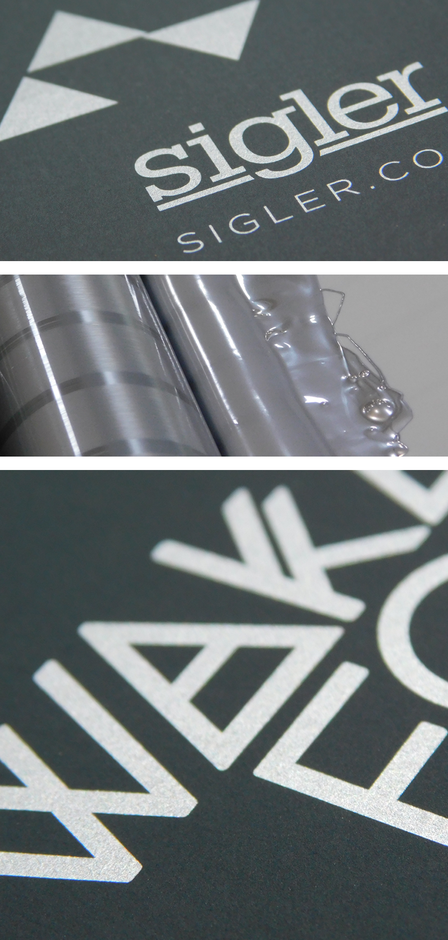
- Design Style: Tone on tone, illustration, geometric pattern
- Ink: PMS Metallic 877 + Black Foil
- Paper: Neenah PLIKE® Papers, Graphite, 122C
Designer’s Commentary with Jenny
My kids and I put the movie Black Panther at the top of the list of our all-time favorite super hero movies. There is something so magical and inspiring about the message, characters and scenery. So when the opportunity came to design this “literally,” I jumped at it. I immediately pictured tone on tone, black on black, very sleek with some super classy surprise elements.
In my 23 years as a designer, this one ranks as one of my favorites. Because this design took courage – I took risks and when I saw the final result it literally took my breath away. The actual design itself is so very simple, but it’s the print and production techniques that make it what it is.
I have ALWAYS loved tone on tone as a design technique, but it scares people – they don’t think it will get noticed or it will just look like a flat, boring piece of paper. However, if it’s done right, it is very impactful. So I went for it – I chose Neenah’s Plike® in Graphite (almost black) with a black foil pattern.
This one also took some thinking beyond my own page – I needed the panther's eyes to pop to create that surprise element, in a way that wasn’t possible on black paper with our fluorescent ink options. My team worked with me to rearrange the pages of the calendar, so that I could die cut the eyes completely out, to reveal the fluorescent paper of the page behind it. I worked with Reid on the placement of his design (October) so that they worked together in a harmony of fluorescent perfection. RISKY! But WORTH IT!
The back page simply features a metallic silver ink that looks AMAZING on this paper! It turned the heads of people walking by on the production floor. We love impressing our production folks.
I hope that you all have a copy of our calendar IN YOUR HANDS so you get the full effect! It just can’t be properly captured digitally.
Click to see a quick video sample of the design as light catches the foil.
PLIKE® Papers are available in 9 rich colors in 2 weights (95 lb text and 122 lb cover). All colors are FSC® Certified. For more information and a peek at color options, visit our friends at Neenah.
If you’d like to make your next print project have maximum impact – Sigler's ready to help. CALL US AT 515.232.6997 or jump right in and fill out our project planner.
To download Black Panther for your screens, click here.
Didn't receive a Sigler calendar this year? Never fear. Download a free printable version here.