Let’s Get Literal (LGL) is a fun, interactive series of designs based on “literal” interpretations. LGL combines several things we love – movies, design and creating campaigns that delight and engage people. This year’s calendar theme is MOVIE TITLES and it’s up to the end-user to guess and then check their answers at LetsGetLiteral.com.
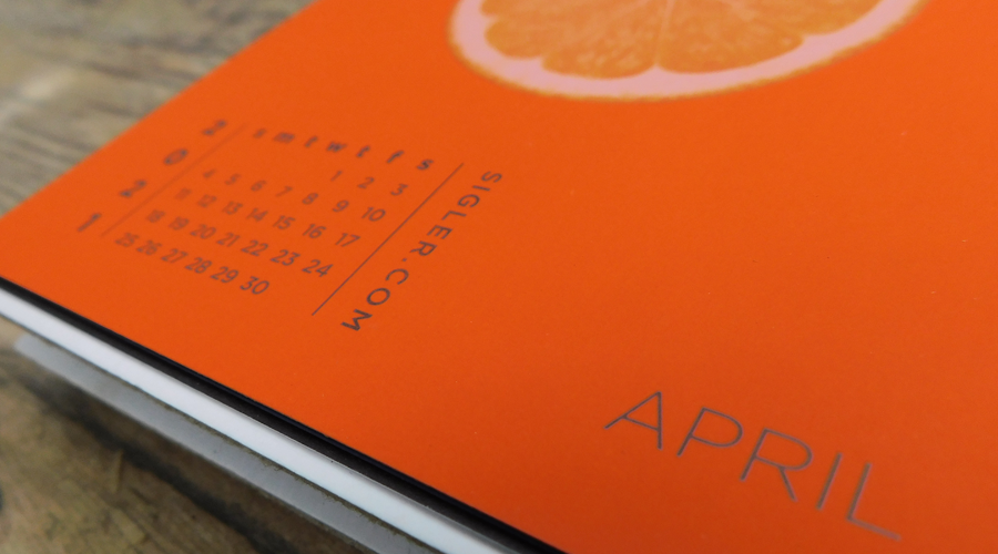
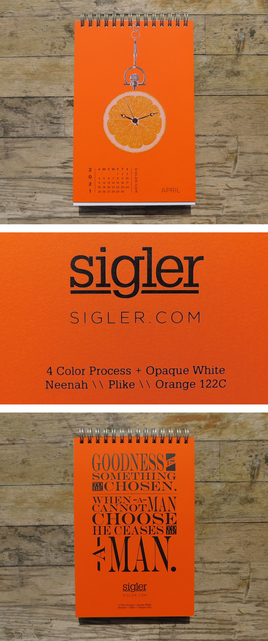
April’s design was inspired by plastic oranges.
- Designer: Gabe
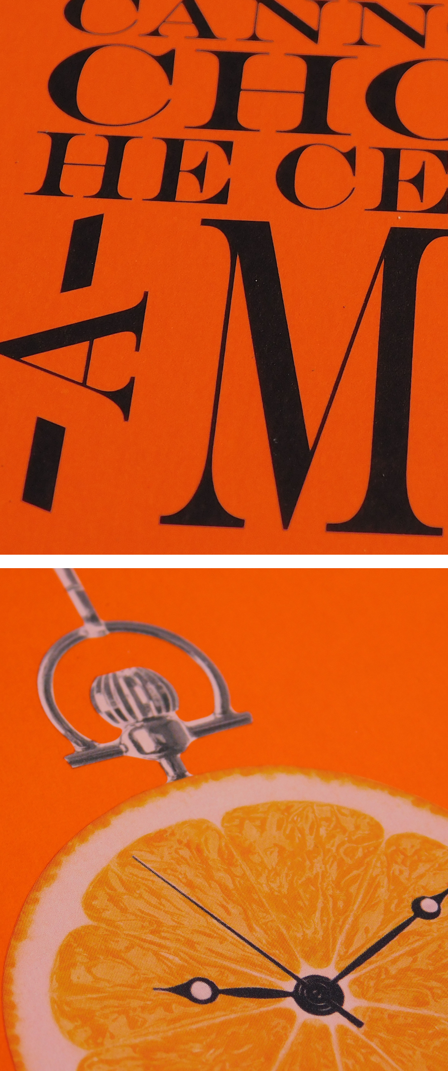
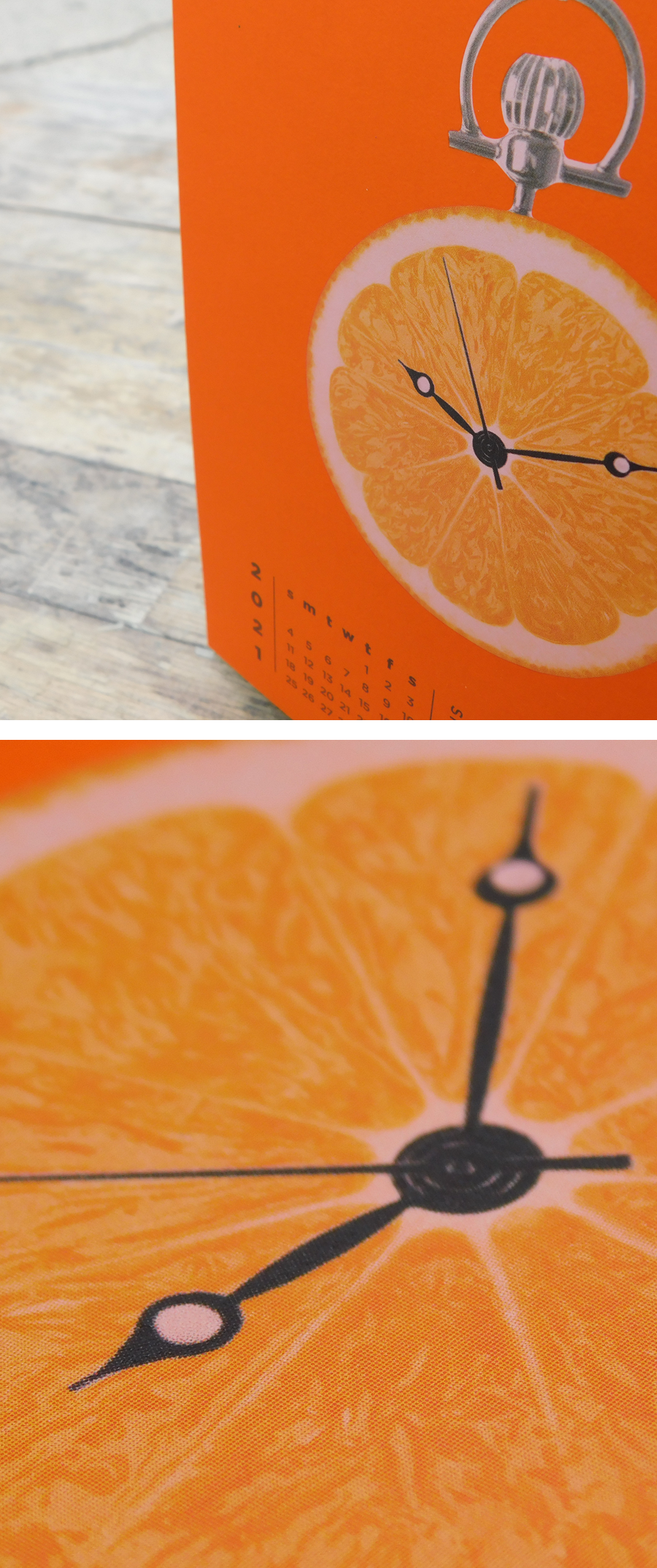
- Movie Title: A Clockwork Orange
- Design Style: Photo manipulation
- Ink: Opaque White + Four Color Process
- Paper: Neenah PLIKE® Papers, Orange, 122C
DESIGNER’S COMMENTARY WITH GABE
This may be a little backwards, but I guess there’s no right or wrong way to start a design. The creative concept for this month’s artwork actually started with a fascination with the PAPER we wanted to feature. We had been looking at Neenah’s PLIKE® Papers, in bright orange, which has a unique matte appearance and one-of-a-kind "plastic-like" surface. Having already designed Ace Ventura and Planes, Trains & Automobiles, I was glad to have a different creative starting point for this project. It’s always nice to mix things up, and it’s truly amazing to see the impact paper can have on both the inspiration for a design and the final results.
Since I had already finished two literal designs for this project, I wanted to push my creative boundaries and utilize a different production technique and design aesthetic. With the Ace Ventura design, I created a fun, colorfully illustrated vector pattern with subtle touches of black foil on classic linen paper. With Planes, Trains & Automobiles, I designed a minimalistic pattern enhanced with shiny copper foil on organic kraft paper. Because my bright orange, plastic-like paper was already a nod to the title, I was able to clearly focus on the elements I still needed to create a literal interpretation of A Clockwork Orange, and ended up simply merging two photographs of a clock and an orange to achieve the final product.
The experience of designing this particular month’s artwork proves once again that details, direction and limitations help ensure a streamlined and efficient workflow for any project. To make sure the orange-clock would really stand out and have more dimension, we first printed the sheet with an opaque white ink as a base. After the sheets dried, we ran them back through the press with 4-color ink. The contrast in visuals is quite striking and inviting to the viewer. I’m really happy with how it turned out!
Press proofing the opaque white ink base.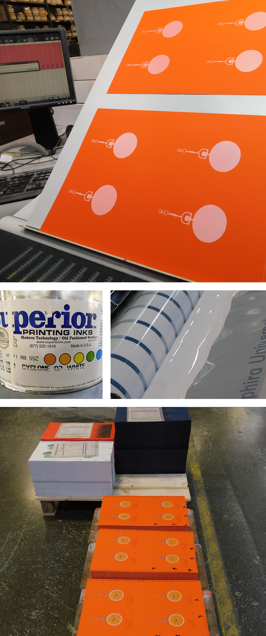
PLIKE® Papers are available in 9 rich colors in 2 weights (95 lb text and 122 lb cover). All colors are FSC® Certified. For more information and a peek at color options, visit our friends at Neenah.
If you’d like to make your next print project have maximum impact – Sigler's ready to help. CALL US AT 515.232.6997 or jump right in and fill out our project planner.
To download A Clockwork Orange for your screens, click here.
Didn't receive a Sigler calendar this year? Never fear. Download a free printable version here.