Let’s Get Literal (LGL) is a fun, interactive series of designs based on “literal” interpretations. LGL combines several things we love – music, design and creating campaigns that delight and engage people. This year’s calendar theme is BAND NAMES and/or ARTISTS. It’s up to the end-user to guess and then check their answers at LetsGetLiteral.com.
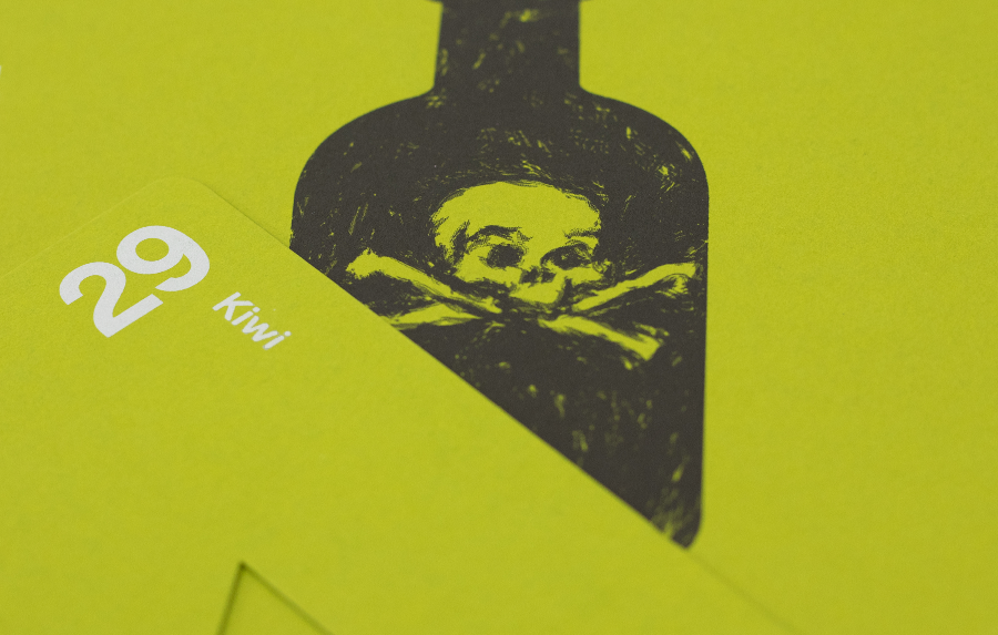
March was inspired by the 80s band Poison!
- Designer: Brian Tucker
- Band Name: Poison
- Design Style: Vector Illustration and Textured Brushes
- Ink: Black
- Paper: Keaykolour Kiwi
Liner notes from Brian
I really struggled to find a style for my design. I knew I wanted the focal-point to be an old-fashioned poison bottle, but I wanted to create “Something to Believe In." At first my Creative Director said, “Look What the Cat Dragged In,” and referred to it as a rose, but "Every Rose has its Thorns." This made me “Cry Tough.” You see, I’m always workin’ slavin’ every day, gotta get away from that same old same old. So I created a new design based on the tattoos found on modern warriors, saddle iron horses of chrome. “Life goes on.” Now my design is “Nothin’ but a Good Time.”
Thanks, Brian for that stunning use of song titles and lyrics from Poison to relay your creative journey!
We chose Keaykolour Kiwi paper to represent the lethal liquid. One hit of black ink for a punch of edgy simplicity. Bam! Sometimes, less is more.
Paper sample.
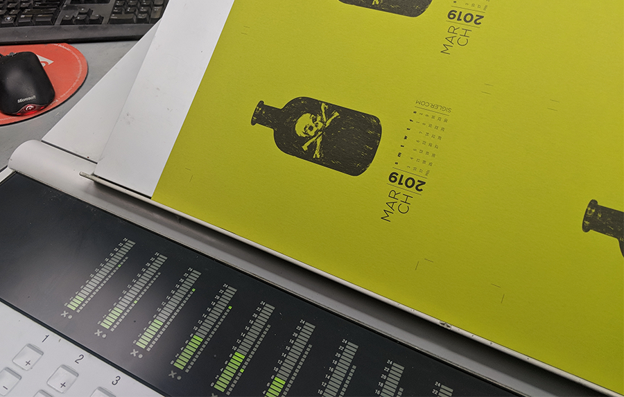
Press plates.

Press sheet straight off the press.
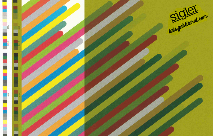
The verdict on Keaykolour Kiwi? This sheet is such a fun shade of green! It's a close match to Pantone 398. CMYK inks are transparent, so the color of the paper dramatically influences the perceived color of the ink as you can see below. Spot Silver Metallic ink, on the other hand, is more opaque, so the color of paper does not affect its appearance as dramatically.
Side by side ink comparison: Pure White paper vs. Kiwi paper
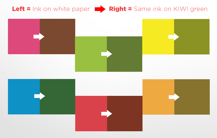
We hope this helps you visualize how paper color can really transform your ink and how to take advantage of the effect – and avoid unpleasant surprises on the press. When in doubt, you can always ask for an ink draw-down on the stock you are using to ensure the aesthetic matches your goals.
If you’d like to make your next print project have maximum impact – Sigler's ready to help. CALL US AT (800) 750-6997 or jump right in and fill out our project planner.
Encore
At the end of each month’s press run, we tossed in a stack of all 12 calendar paper colors for samples. Below shows what each month’s design looked like on Keaykolour Kiwi.


Rock on!
Download "Poison" for your screens here.
Didn't receive a calendar? Never fear. Download a free printable here.
