Let’s Get Literal (LGL) is a fun, interactive series of designs based on “literal” interpretations. LGL combines several things we love – movies, design and creating campaigns that delight and engage people. This year’s calendar theme is MOVIE TITLES and it’s up to the end-user to guess and then check their answers at LetsGetLiteral.com.
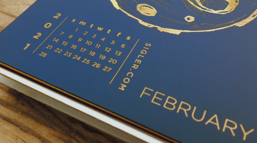
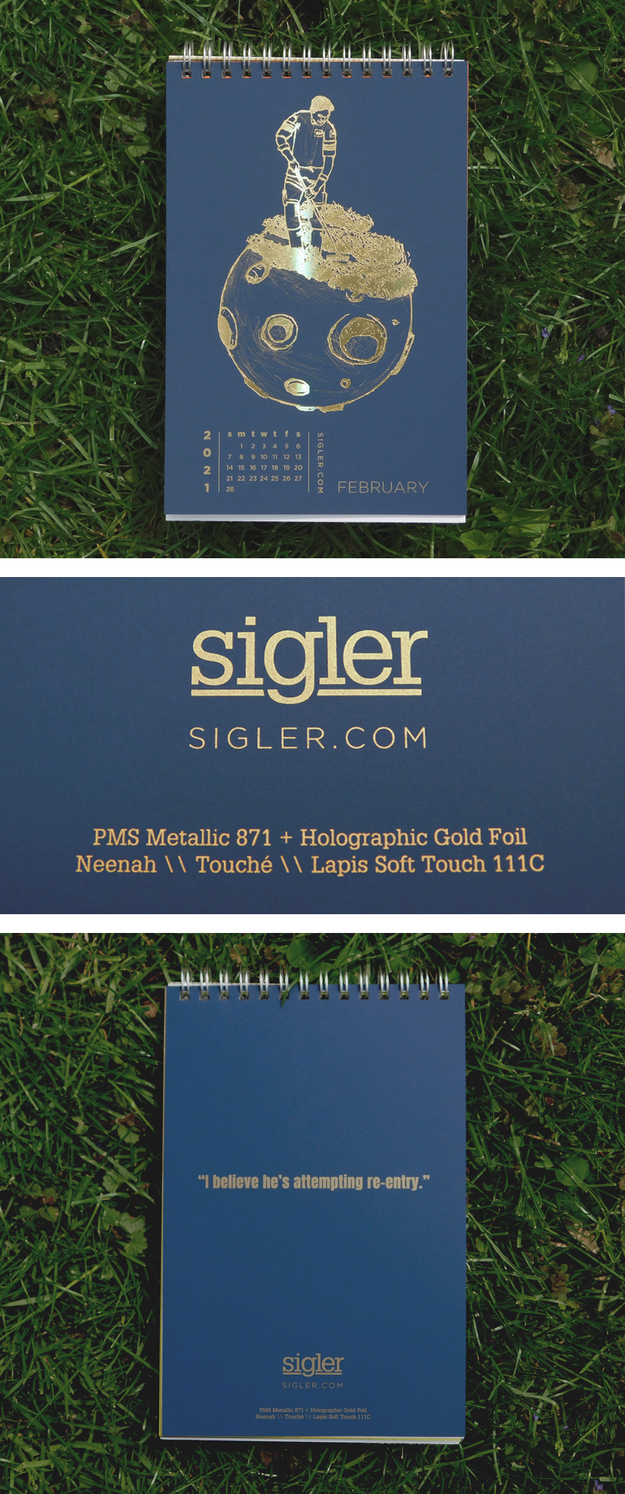
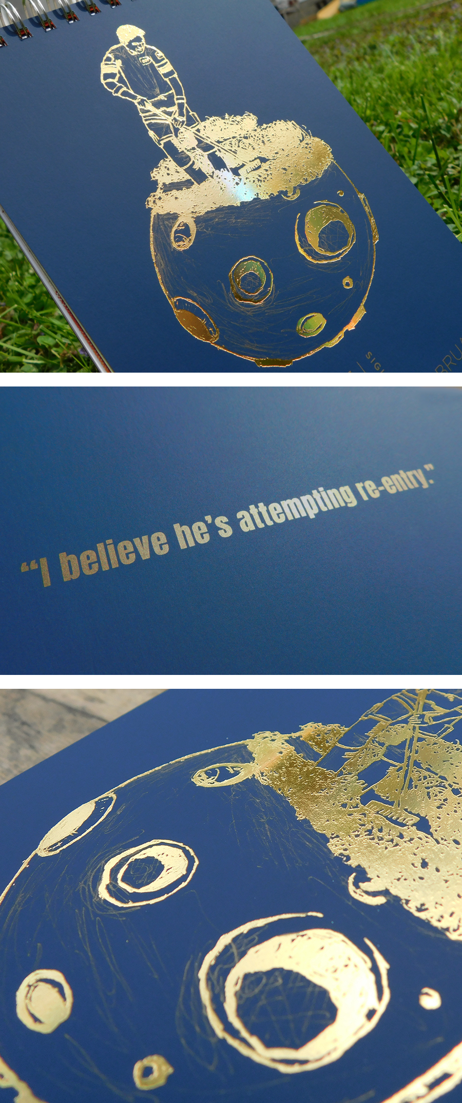
February’s design was inspired by the draw of deep space.
- Designer: Nick
- Movie Title: Moonraker
- Design Style: Graphite Illustration
- Ink: PMS Metallic Gold 871 + Holographic Gold Foil
- Paper: Neenah TOUCHÉ®, Lapis Soft Touch, 111C
DESIGNER’S COMMENTARY WITH NICK
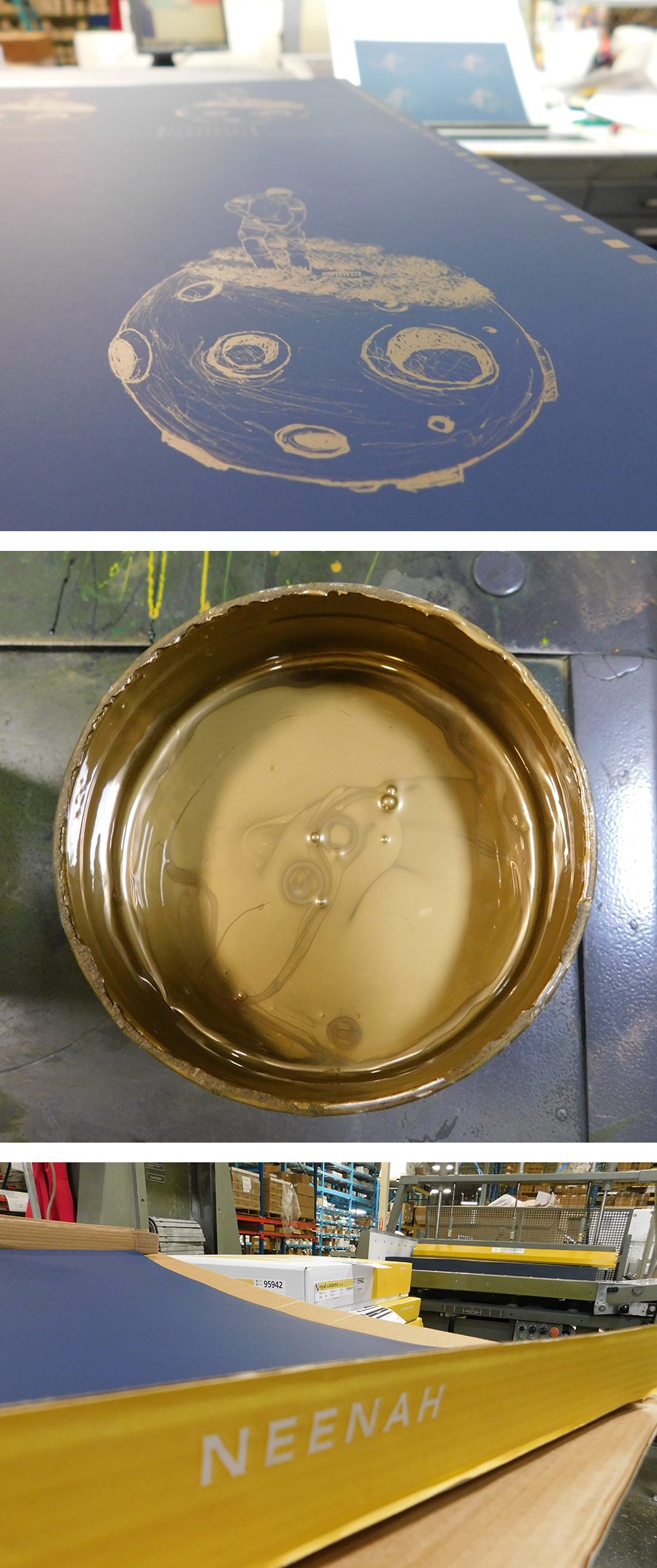
I chose to do Moonraker, as the subject matter appealed most to me from a “Let’s Get Literal” perspective. I enjoyed the idea of an astronaut tending to crops on the surface of the moon. To create the image I did a composite graphite illustration of a farmer raking row crops, drawing in the details of an astronaut’s uniform. I then placed the “farming astronaut” on a separate illustration of a moon and merged the two images. The composite illustration was then scanned and the fine lines of the drawing were accentuated to ensure the metallic ink would pick up those small details.
To imitate the “blackness” of space, I chose Neenah’s TOUCHÉ® Lapis Soft Touch paper - which is a premium matte paper with zero reflective qualities. It’s a rich, densely opaque sheet. I loved the stark contrast between the velvety paper and the gleaming reflectiveness of the holographic gold foil I planned to use.
This combination made the illustration really stand out while still retaining a surprising amount of fine line details of the original drawing.
Hope you all enjoy it.
On the press...
Press sheet showing gold metallic ink prior to foil application and our foil sample. Nick inspecting his work. Close-up of the gold holographic foil after application.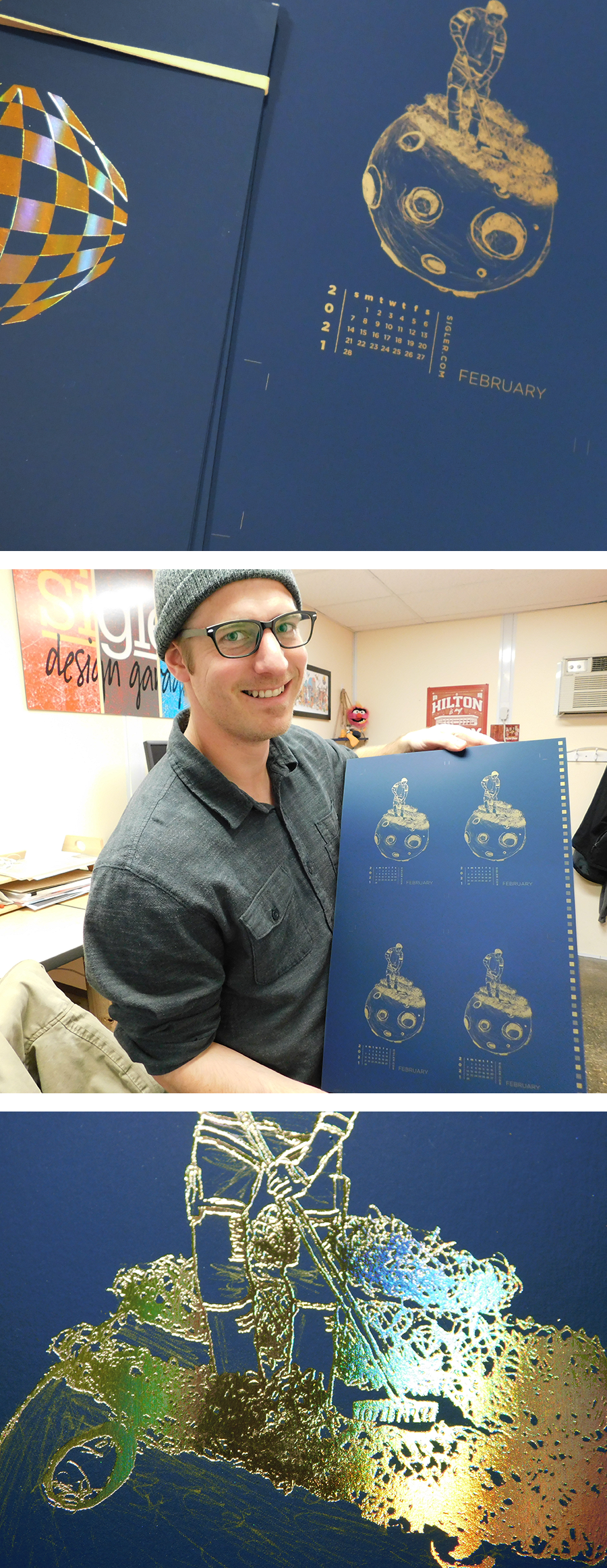
TOUCHÉ® papers are available in 13 beautifully sophisticated colors plus a white/black duplex option. For more information and a peek at color options, visit our friends at Neenah.
If you’d like to make your next print project have maximum impact – Sigler's ready to help. CALL US AT 515.232.6997 or jump right in and fill out our project planner.
To download Moonraker for your screens, click here.
Didn't receive a Sigler calendar this year? Never fear. Download a free printable version here.