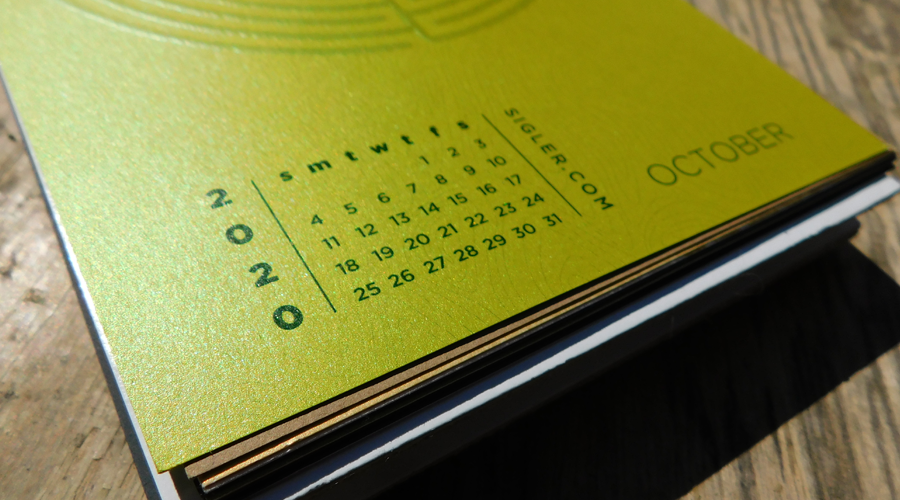
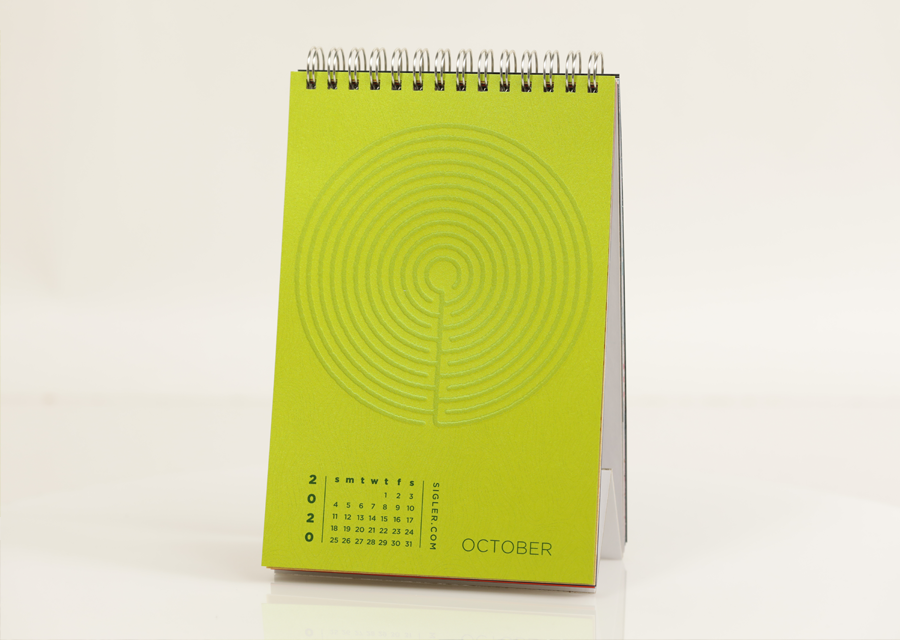
October's design was inspired by hedged gardens designed for cinematic terror and suspense.
- Designer: Reid
- Movie Title: Labyrinth
- Design Style: Geometric illustration
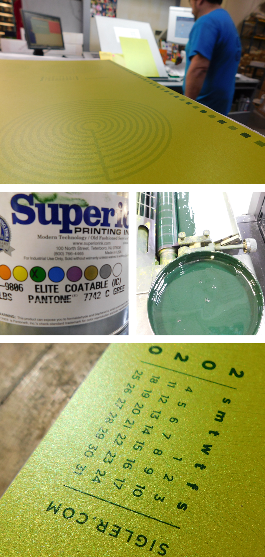
- Ink: PMS Metallic 7742 + Emboss
- Paper: Neenah SO...SILK®, Shocking Green, 92C
DESIGNER’S COMMENTARY WITH Reid
Whether it was The Shining, Harry Potter and the Goblet of Fire, Maze Runner, Alice in Wonderland or Labyrinth, everyone remembers the scene in the movie that’s looking down over a seemingly endless hedge maze. With these images in mind the inspiration for my Labyrinth design was set. To accentuate the fuzzy green hedges of the labyrinth, we added an emboss and used tone on tone ink. I’ve always had a fondness for topographical maps so I felt this was the perfect time to slip the texture created by the elevation maps into the background as well.
It was around this time in the design process when I realized that “labyrinth” and “maze” are synonymous with each other in the English language. This led to researching Greek mythology and the structure built in Knossos to hold in the Minotaur, which was later killed by Theseus… but I digress. The classical labyrinth as described by the Greeks did not have dead-ends like in a maze; there was no need to choose your turn or direction, but to simply follow a single path leading from the entrance to the center.
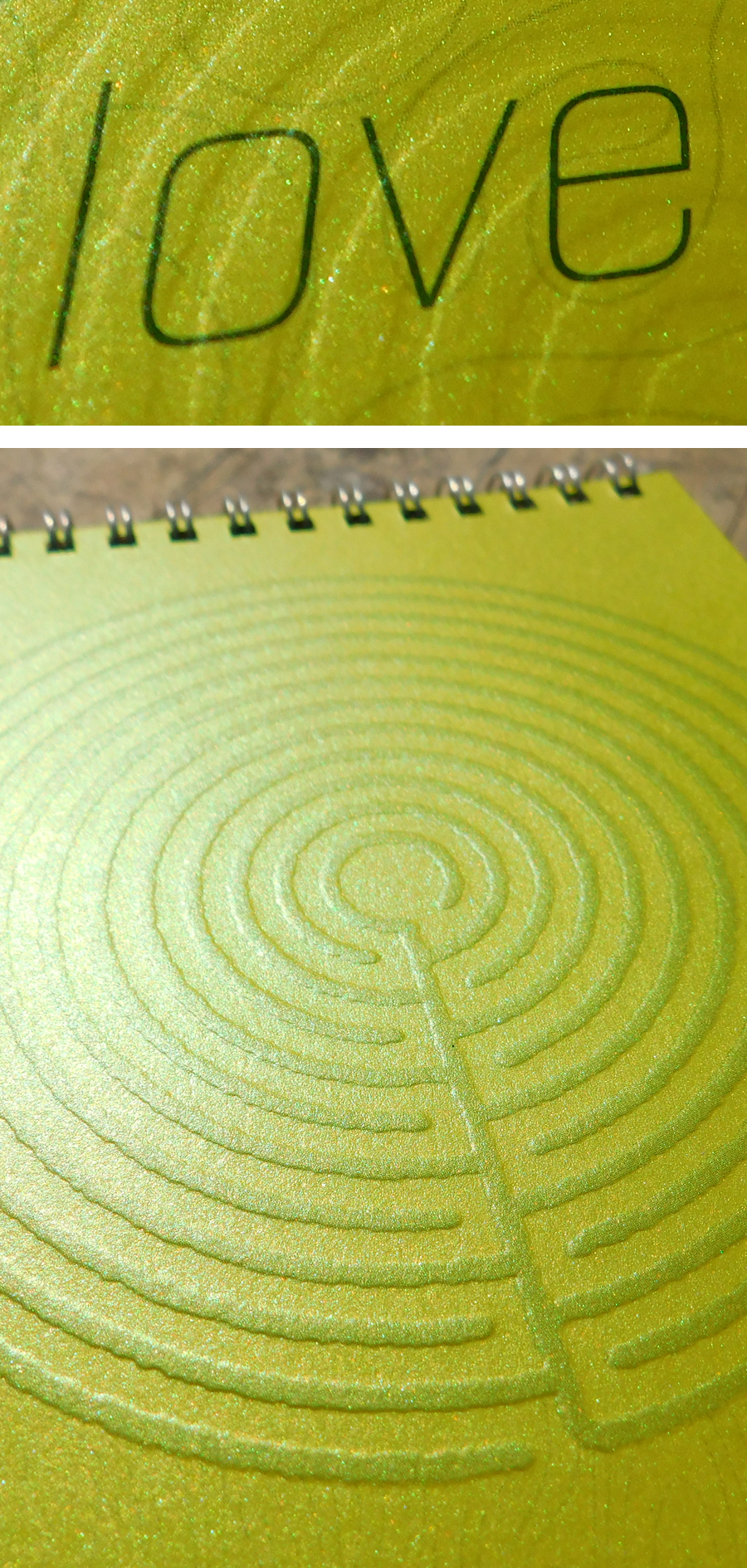
So after gaining this new insight, I realized I needed to remove the hedges that created dead ends from my original design to make it a true labyrinth. In the redesign, the objective of getting someone to identify this image as a labyrinth could only be achieved if first they told themselves, “This isn’t a maze.”
Did it work?
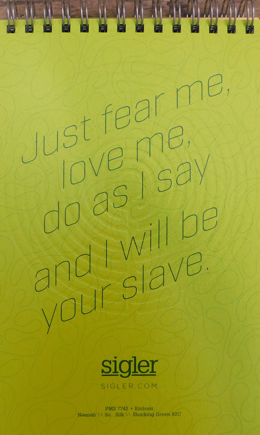
For my paper, I chose Neenah’s SO...SILK® Shocking Green as it worked perfectly for my classical English hedged garden. We used the green shimmer in collaboration with September’s page to make Black Panther’s eyes really pop…and because I think David Bowie would have appreciated the extra shimmer.
SO..SILK® Papers are unusually smooth, luxurious and silky to the touch. The bold, iridescent fashion colors will definitely bring attention to your design – perfect for invitations, cards, brochures and luxury packaging. Available in 8 colors and 3 weights. All colors are FSC® Certified. For more information and a peek at color options, visit our friends at Neenah.
"Should you need us..."
If you’d like to make your next print project have maximum impact – Sigler's ready to help. CALL US AT (800) 750-6997 or jump right in and fill out our project planner.
To download Labyrinth for your screens, click here.
Didn't receive a Sigler calendar this year? Never fear. Download a free printable version here.