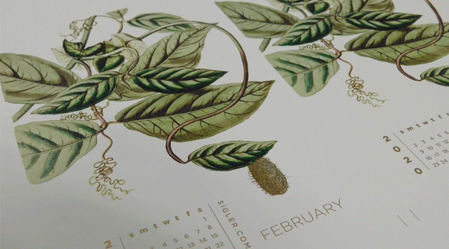
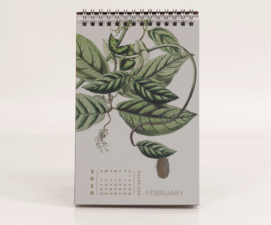
February’s design was inspired by paper as soft and touchable as Wilford Brimley's moustache.
- Designer: Heather Cramer
- Movie Title: Cocoon
- Design Style: Public Domain Vintage Illustration + Photoshop
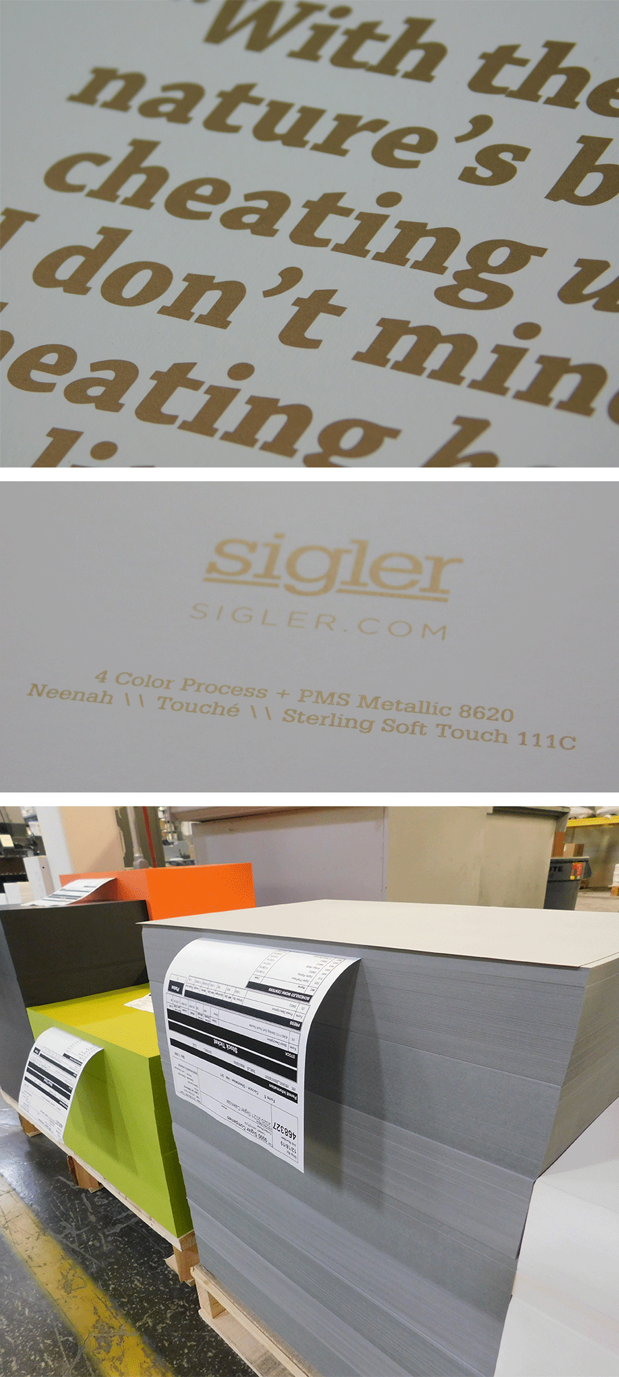
- Ink: 4-Color Process + PMS Metallic 8620
- Paper: Neenah TOUCHÉ®, Sterling Soft Touch, 111C
Designer’s Commentary with Heather
Our calendar theme this year, literal depictions of movie titles, was not as easy as one would think. However, when I saw Cocoon on the list, I knew I wanted to try it. Who doesn't love an overly sentimental 80s movie about geriatrics enjoying the spoils of newfound vigor from alien pods stored in a swimming pool? Plus, I may have a soft spot for Wilford Brimley.
The first visual that popped into my head was a beautiful, solitary monarch chrysalis with that stunning band of gold. However, a cocoon and a chrysalis are, in fact, NOT the same thing. So there went that idea.
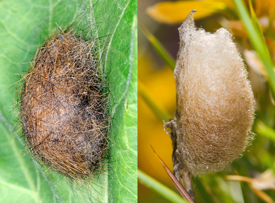
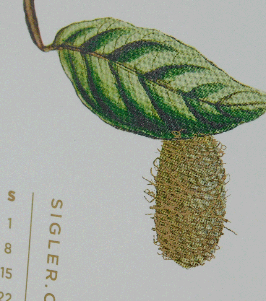
My kids and I have raised many woolly bear caterpillars, so I wanted to emulate their furry structure. But, I didn't want it to be all up in a person's face for an entire month. So how does one depict a cocoon in a visually interesting yet (hopefully) discernible way?
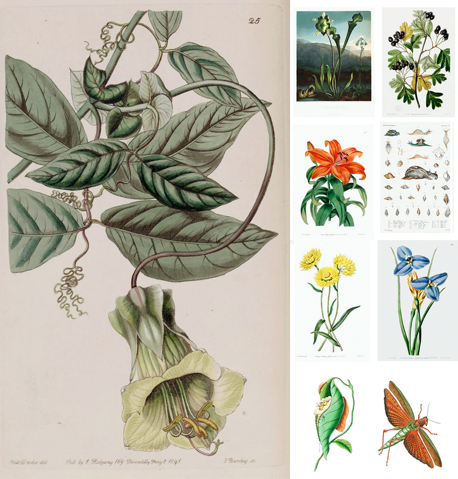
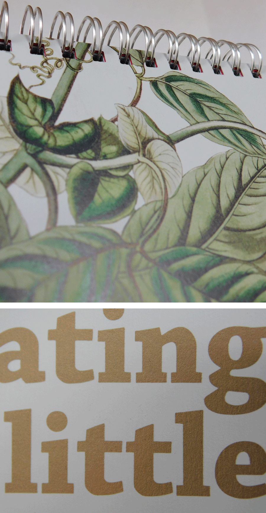
I'm a huge fan of vintage illustrations. I've scoured the internet many times to find images that are now in the public domain, and therefore usable by any creative soul with the patience to seek them out. There are LITERALLY millions of wildlife and botanical illustrations from journals around the world available for free. The Biodiversity Heritage Library’s Flickr account is just one example.
This is where I found the beautiful leafy backdrop to house my wee cocoon.
Original illustration plus some examples of all the wonderful vintage illustrations in the public domain.
Another element I wanted to explore was "touch."
I wanted to find a paper that would encourage a tactile experience and Neenah TOUCHÉ® was the perfect fit. TOUCHÉ paper has a luxurious matte finish. It truly is "petal soft!" It is similar to the feel of soft touch aqueous coating, but even better – no fingerprinting.
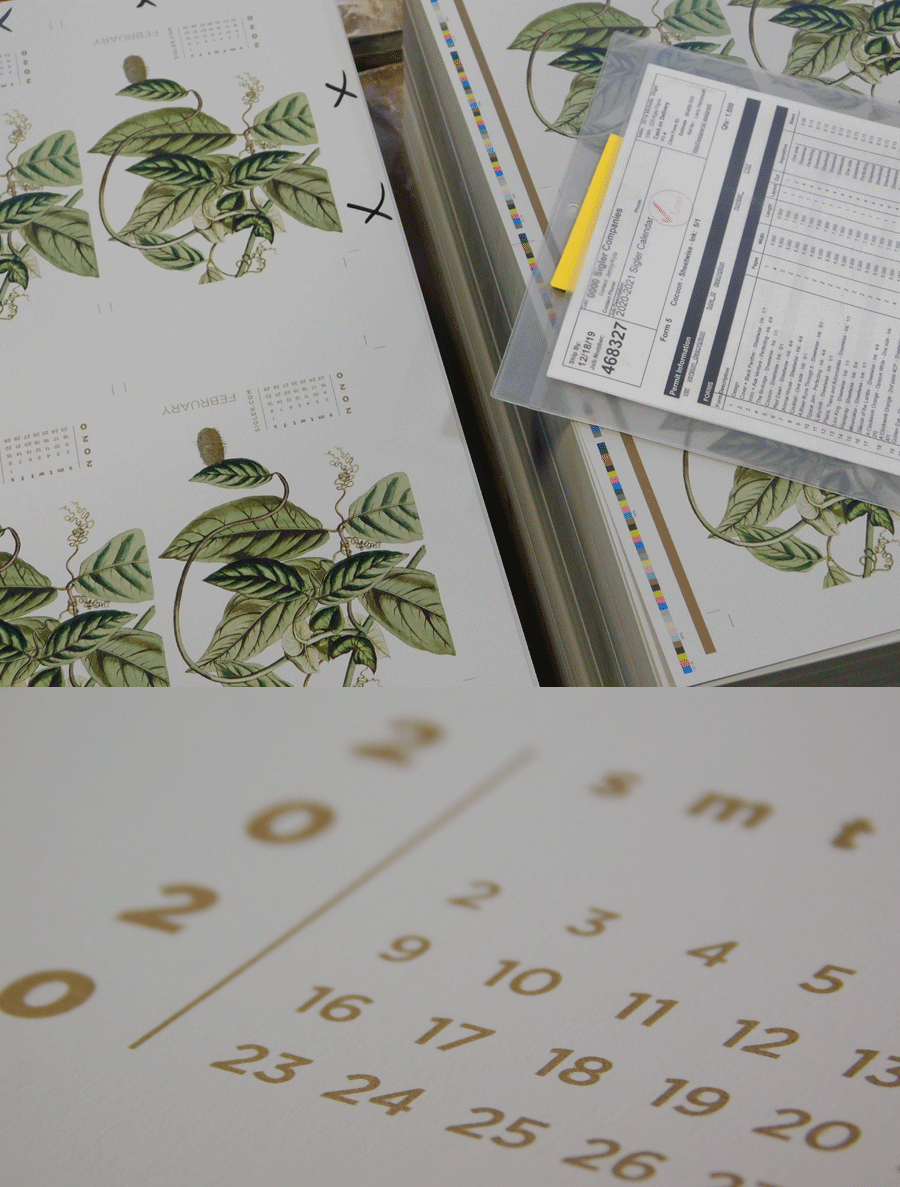
I selected Sterling in 111C weight, which is a beautiful gray, to deepen the hues of the illustration and to show how gray paper can truly enhance 4-color printing. I removed the background entirely and rearranged the leaves and tendrils to better fill the composition – leading the eye down to where I would place the cocoon.
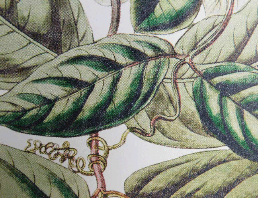
Since I couldn't find a cocoon in a similar style, I deconstructed a photograph and tried to match the moiré pattern as closely as possible to make it seem like it was original to the illustration. I wanted to exaggerate the "hairs" since they were printing in the bronze metallic ink. While the metallic ink is subtle, you can definitely see the shimmer when light strikes it at different angles.
Another interesting thing, if you look at the printed piece closely, you'll see that the heaviest saturation in the 4-color ink has a shiny, glossy quality to it. Almost like it has a coating. It's a fantastic contrast with the gorgeous flat matte of the paper.
I took some creative liberties, but was thrilled to finally put a vintage illustration into a design. I HIGHLY recommend TOUCHÉ paper. It prints like a dream and I literally cannot stop touching it. It's extraordinary.
TOUCHÉ® is available in 13 beautifully sophisticated colors plus a white/black duplex option. For more information and a peek at color options, visit our friends at Neenah.
If you’d like to make your next print project have maximum impact – Sigler's ready to help. CALL US AT 515-232-6997 or jump right in and fill out our project planner.
To download "Cocoon" for your screens, click here.
Didn't receive a Sigler calendar this year? Never fear. Download a free printable version here.

