Let’s Get Literal (LGL) is a fun, interactive series of designs based on “literal” interpretations. LGL combines several things we love – music, design and creating campaigns that delight and engage people. This year’s calendar theme is BAND NAMES and/or ARTISTS. It’s up to the end-user to guess and then check their answers at LetsGetLiteral.com.
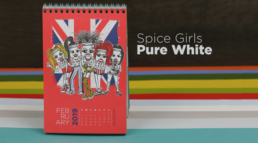
February kicks off with... Spice Girls!
- Designer: Amy Sengbusch
- Band Name: Spice Girls
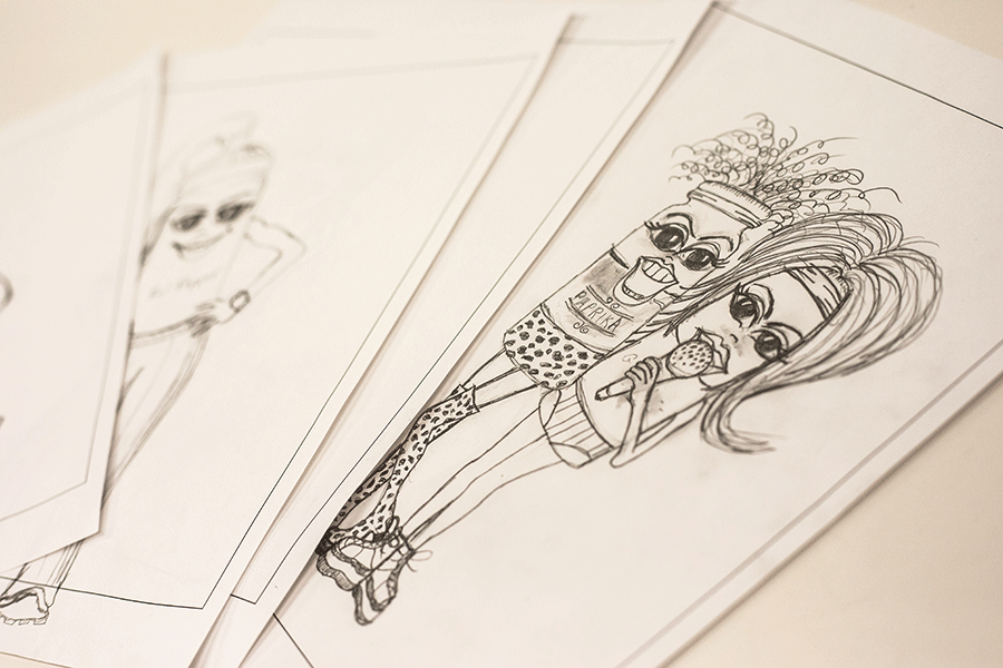
- Design Style: Illustration in pencil
- Ink: 3 Spot Colors: 1788, 7548, 2945 + Black
- Paper: Keaykolour Pure White
Liner notes from Amy
Having a daughter who grew up in the “Spice Girls” era, I knew who they were, but probably couldn’t name one song. However, when I thought about their band name, I immediately pictured spice jars coming to life as the girls in the band, and had to give it a shot! I did some research on what outfits each girl wore and the vibe they each exuded. I love to draw so I did a characterized pencil sketch of each girl with her body as a spice bottle. I scanned in the pencil drawings and drew over them in Illustrator using the pen tool. I used the varied width tool in Illustrator so the lines would have more variation. I filled some shapes in with color to give it the right amount of flair. I used the British flag in the background to give people a little hint.
Originally, I was going to print on a Keaykolour Coral paper, but I didn’t think I could achieve the vibrant colors that I wanted. Instead, I chose Keaykolour Pure White and simulated the coral paper color using a flood of PMS spot 1788. I like the way it turned out and I had so much fun doing it!
Paper sample.

Mixing the PMS 1788.

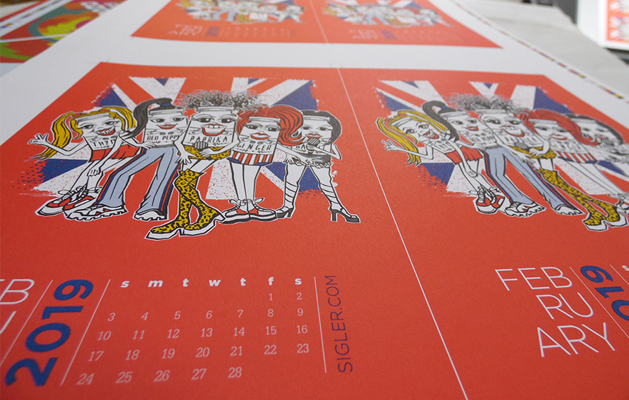
Press sheets straight off the press.
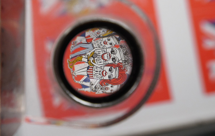
A close-up view through the loop.
Hope you all enjoy the “Spice Girls” as we wrap up winter, hopefully. – Amy
The verdict on Keaykolour Pure White? This sheet is a nice bright white that handled very heavy ink coverage without any extra drying time or additional coatings. Great option for any project calling for uncoated paper. Plus, matching envelopes are available (bonus!)
If you’d like to make your next print project have maximum impact – Sigler's ready to help. CALL US AT (800) 750-6997 or jump right in and fill out our project planner.
Encore
At the end of each month’s press run, we tossed in a stack of all 12 calendar paper colors for samples. Below shows what each month’s design looked like on Keaykolour Pure White.

Rock on!
Download "Spice Girls" for your screens here.
Didn't receive a calendar? Never fear. Download a free printable here.