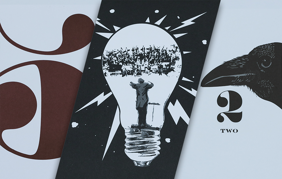
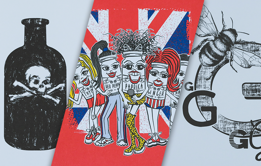
Let’s Get Literal (LGL) is a fun, interactive series of designs based on “literal” interpretations. LGL combines several things we love – music, design and creating campaigns that delight and engage people. This year’s calendar theme is BAND NAMES and/or ARTISTS. It’s up to the end-user to guess and then check their answers at LetsGetLiteral.com.
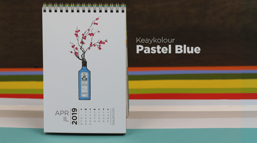
No foolin’... April’s design was inspired by 90s nostalgia and distilled spirits.
- Designer: Gabe Searles
- Band Name: Gin Blossoms
- Design Style: Vector Illustration
- Ink: 4-Color Process (CMYK)
- Paper: Keaykolour Pastel Blue
Liner notes from Gabe
I’m a singer, a songwriter and a graphic designer. As a musician for 25+ years, playing music on a guitar comes as natural to me as developing a design on a computer. With music, there’s a main melody and a supporting chord structure that combine and work together to create something memorable, something that stays with the listener/the audience, something to sing along to – a song. With design, there’s a main message and supporting colors and elements that combine and work together to create something memorable as well, something that stays with the audience – a design. Approaching this design for our “Let’s Get Literal” campaign was a fun and natural collaboration of those two worlds.
My first step was to think about a band that would be inspiring enough to get a creative spark going. Being a 90s kid, I gravitated toward some of those beloved brooding bands. Like, Pearl Jam? No, too obvious. Blind Melon? Nah, the same. What about Red Hot Chili Peppers? Mmmm, nah, too simple. Finally, I remembered that I had been recently performing “Hey Jealousy” by Gin Blossoms – and that’s when the creative spark ignited!
The Gin Blossoms provided the perfect amount of 90s nostalgia and room for creative interpretation to start my creative fire and keep it going until I finally had a stem of beautiful blossoms emerging from a bottle of my personal favorite distilled spirit.
Paper sample.
 B-side: Straight off the press

Press checking plate alignment
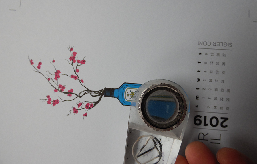
Macro views through the loop


The CMYK press plate.

Encore
At the end of each month’s press run, we tossed in a stack of all 12 calendar paper colors for samples. Below shows what each month’s design looked like on Keaykolour Pastel Blue.
No foolin', we looooove Keaykolour Pastel Blue! It dries fast. Colors hold their vibrancy and look rich and amazing. Get adventurous with your next project and try out some Pastel Blue. This paper is SO...well, pretty!


If you’d like to make your next print project have maximum impact – we’re ready to help. CALL US AT (800) 750-6997 or jump right in and fill out our project planner.
Rock on!
Download "Gin Blossoms" for your screens here.
Didn't receive a calendar? Never fear. Download a free printable here.