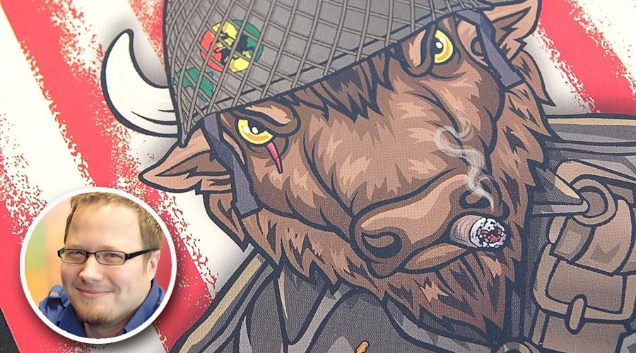
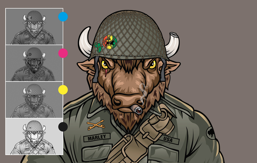
"Buffalo Soldier" is an illustration by Tony Kukla. Since it was designed specifically for Sigler's 2017-2018 promotional calendar, it was created in CMYK color mode for offset printing.
So what do you do if you want to feature this design on apparel?
Traditional screen printing requires artwork designed in spot-colors so you'll likely need to modify your design. In screen printing, each individual color requires its own screen mesh. Inks are then pushed through the screens one color at a time onto the apparel – much like a stencil. The number of colors in your design affects the cost of your project because each color requires its own screen and setup time. Reduce the number of colors, reduce the price!
We asked Tony to give us a quick visual breakdown using "Buffalo Soldier" as an example. He will reduce the CMYK design down to 6, 4, 3, 2 and just 1 spot-color. He'll also mention a few tricks and techniques to get the most out of a limited color palette.
The original illustration in CMYK color mode:
Tony: I typically design for apparel and promo items where color usage is limited. Knowing that this particular design would print on an offset printing press in CMYK, it was nice to splurge on extra colors, gradients and intricate details. Below you can see the separation of Cyan, Magenta, Yellow and Black – which are the core colors that overlay one another for CMYK printing.
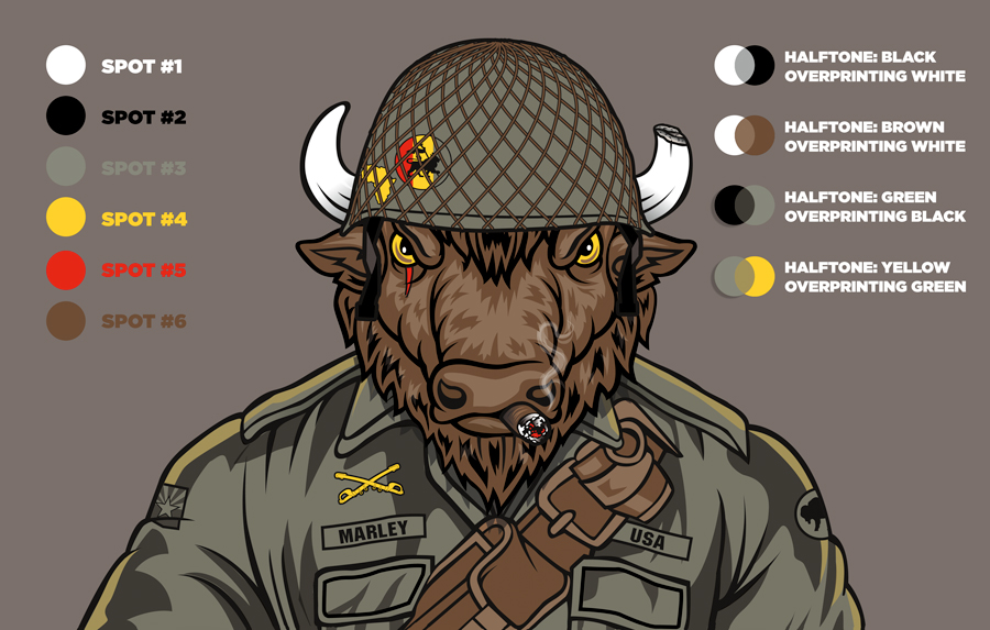
Reduced to 6 spot-colors:
Tony: Notice how similar this design is to the CMYK original? By utilizing halftones and overprints, I was able to simulate additional colors without USING extra colors. It can be as simple as using a 35 percent transparency over an existing color or having it blend from one color to another. This visually tricks the eye – especially when viewed at a distance. Similar to pointillism, you’ll notice individual dots of one color with the other color behind it. This is how the light brown, gray shading and midtone yellows were achieved.
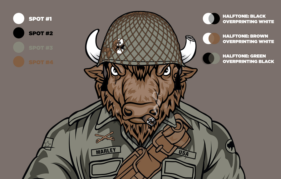
Reduced to 4 spot-colors:
Tony: Here I’ve reduced the design to 4 spot-colors, still using halftones and overprints to create the darker green shadows on the jacket and the light brown highlights on the face. With screen printing, the dots are a much larger size than in paper printing, making them more noticeable to the eye. If the design isn't large enough, the halftone dots can actually muddy your color – making it look dirty instead of simulating a new hue. If you’re not a fan of halftone dots, solid color is the way to go. When in doubt, give us a call and we can work together to achieve the effect you are going for.
Reduced to 3 spot-colors:
Tony: At 3 colors, you really need to play with the color combinations. Since "Buffalo Soldier" is a military theme, I thought a monochromatic color palette was a perfect fit. This is a great example of letting the color of the garment act as an additional color.
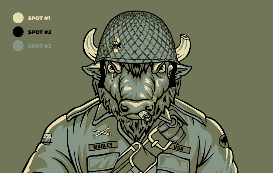
We chose the 3 spot-color design and screen printed it on a super soft, camouflage Alternative® Apparel t-shirt. Visit Let’s Get Literal for a chance to WIN one of your very own!
Reduced to 2 spot-colors:
Tony: At 2 colors, minimal use of a high contrast color can create highlights that really make your design pop. Get creative. Simplified doesn't have to equal boring.
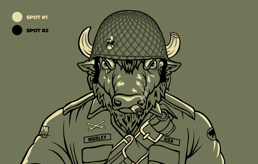
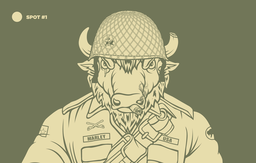
Reduced to 1 spot-color:
Tony: 1 color designs typically have a larger variety of sizes and print crisper than multi-colored designs at smaller sizes. However, the contrast between your garment and your spot-color are very important – especially for designs featuring characters or people. Make sure you don’t inadvertently create the illusion of a photo negative. If your design will be screen printed on both light and dark garments, you may need (2) separate designs using an "ink change" to avoid that problem.
Tony: Below is the exact same 1 color design on a light garment with dark ink. With a few adjustments, you can vastly improve your design. Pay special attention to eyes!
Thanks, Tony! As you can see, each design has its own aesthetic. Your budget may dictate your choices and the color of the garment certainly plays a vital role as well. The key is to optimize your design and make sure all the elements work together well. When in doubt, please contact us, we can help ensure your design will be all it can be. For additional information on screen printing tips at Sigler, you can read our "Ask the Experts" blog here.
Don't forget to visit Let’s Get Literal for a chance to WIN Tony's design on a T-shirt!