Let’s Get Literal (LGL) is a fun, interactive series of designs based on “literal” interpretations. LGL combines several things we love – music, design and creating campaigns that delight and engage people. This year’s calendar theme is BAND NAMES and/or ARTISTS. It’s up to the end-user to guess and then check their answers at LetsGetLiteral.com.
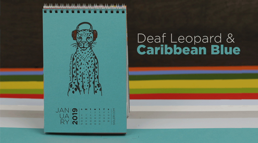
Leading off Sigler’s 2019 desktop calendar is (one-armed drum roll…) DEF LEPPARD!
- Designer: Heather Cramer, Creative Director
- Band Name: Def Leppard
- Design Style: Pen & Ink illustration
- Ink: 2 Spot Colors (1817 and 032)
- Paper: Keaykolour Caribbean Blue, 111C weight
Liner notes from Heather
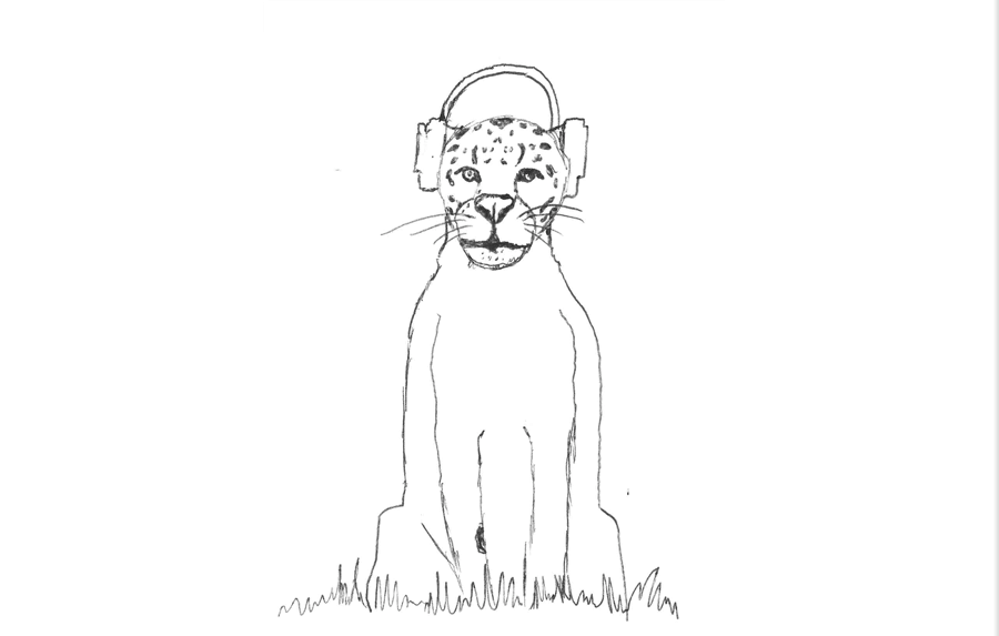
As a lover of the 80s and all things hair metal, English rock group, Def Leppard, was an obvious choice for our LGL Band name theme. Depicting a leopard wearing fancy noise-cancelling headphones seemed like a more interesting and timely take on not being able to hear – inspired by my many failed attempts at getting the attention of fellow designers (and my children) while they are wearing headphones!
Sketched in pen & ink, I scanned my original drawing and fine-tuned it in Photoshop. I added a subtle layer of grunge for a well-worn texture. I added a simple line of text hugging the body as an additional clue.
I chose Keaykolour Caribbean Blue for my paper – a rich, beautiful uncoated sheet with a subtle texture of its own. My goal was muted simplicity, so I limited the color palette to just 2 spot colors. In hindsight, I could have used an opaque white ink as a base for the red headphones to really make them pop, but I chose instead to illustrate how a normally bright ink performs on a dark sheet without a base. Overall, I'm quite pleased with the final design.
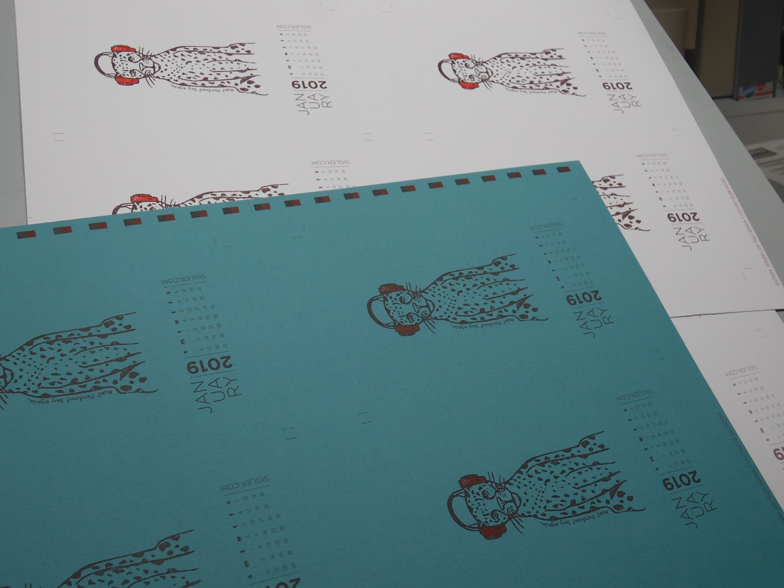
 Press sheets straight off the press.
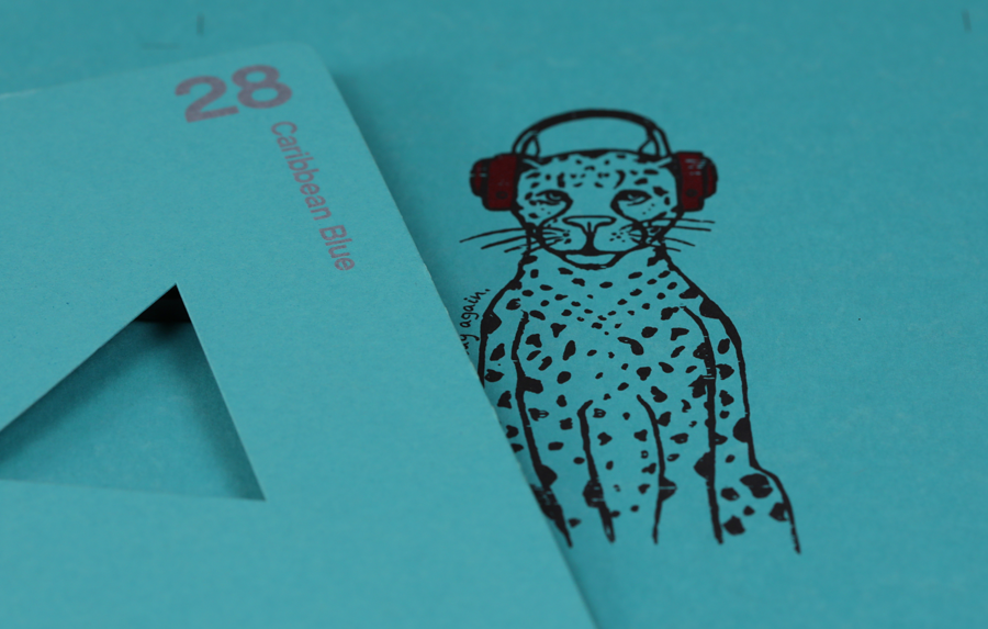
A close-up view through the loop.
Hope you all enjoy the “deaf leopard” during his month’s reign. – Heather
The verdict on Keaykolour Caribbean Blue? It dries very fast for an uncoated sheet and would be a wonderful choice for your next project! Perfect for annual report covers, invites, posters, etc. Pair it with metallic inks, foils or elegant embossing and dielines – you’re sure to create something unique and memorable. Plus, matching envelopes are available (bonus!)
If you’d like to make your next print project have maximum impact – Sigler's ready to help. CALL US AT (800) 750-6997 or jump right in and fill out our project planner.
Encore
At the end of each month’s press run, we tossed in a stack of all 12 calendar paper colors for samples. Below shows what each month’s design looked like on Keaykolour Caribbean Blue. To see how drastically a white opaque base can impact the ink’s vibrancy on an uncoated colored sheet, be sure to read our Dixie Chicks design blog – coming soon!)
Rock on!
Download your own "Deaf Leopard" for your screens here.
Didn't receive a calendar? Never fear. Download a free printable here.